EMFRAMED
VISUAL IDENTITY | WEB DESIGN | PRINT
EMFRAMED is a visual identity proposal for a project that combines immersive environments, cultural events and projection mapping in an innovative concept.

The brand represents a new series of events that would combine technology and cultural events through applying projection mapping images in concerts, theathre and dance shows.
That justifies the choice of colors that are vibrant and warm. I created contrast through dark shades of grey and white and in the secondary palette I even spiced it up with some cold shades such as blue, giving shapes a light-art appearance.


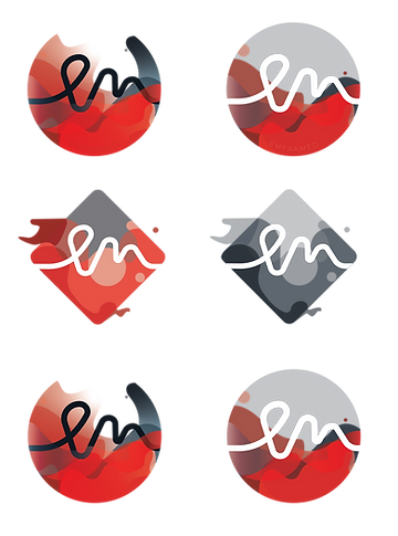
MONOCHROME
COLOR
The logo and name were chosen to represent key concepts of the project and name. They are both unique and modern.
The font is a sans-serif one all-throughout, with nice round curves and clean edges. It supports the fluidity of the brand and applies well to both digital and print environments.

Montserrat
Aa Bb Cc Dd Ee Ff Gg Hh Ii Jj Kk Ll Mm Nn Oo Pp Qq Rr Ss Șș Tt Țț Uu Vv Ww Xx Yy Zz


All the norms and usage rules for the logo, font, types of shapes and colors can be found in a comprising 50 pages brand-book.

For the promotional materials I tried to think of the practicality each represents, how, when, and where they interract with the public and which type of advertising is needed in order to show a consistent feel of the brand and assure brand recognition on the target market.


The events are what needs to be promoted. With that in mind the path is clear - tickets for the show, branded CD cases, some old-school flyers and brochures, and of course pins and tote bags for the young audience.


The idea had to be pitched for a jury of five where the three above works served as presentation boards of a dimension of 100x70cm.